30 Years in the Making: A Bolder Expression of Aer Studios
|3 min read

Today marks a huge milestone for us: we're launching an upgraded visual brand and website for Aer Studios.
After 30+ years of designing and building robust digital products, quietly and diligently, for organisations like the BBC, Dogs Trust, CEPI, Great Ormond Street Hospital and Historic Royal Palaces, we wanted to shout a little louder about who we are, and what we stand for.
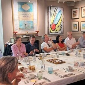
It all started in our big meeting room, surrounded by post-it notes and dry-wipe scribbles. In the ensuing series of workshops led brilliantly by then consultant, Scott Ewings (now our CSO - yeah, we asked him to stay) we realised the flurries of excitement in the room - talking about our clients, our successes, and our passions - were being lost to the outside world.
If we’re so proud, so excited and so confident in what we do, why aren’t we telling anyone?
Soon these discussions became ideas, standards, guidelines, and plans - before our very eyes a strategy formed. At its heart was a simple truth: the work we do is important. Building digital products across education, broadcast, healthtech, charity, and the public sector carries exceptionally high stakes. For us, and for our clients, this stuff really matters.
If a charity’s donation journey is confusing or a critical public service portal fails, the cost isn't just a dropped metric - it's a missed opportunity for real-world impact. These are the things we pour over, the details we sweat, and the impact we strive for.
Making Room for What Matters
Pretty soon we had a manifesto and a roadmap. Clear, defined language around what we do best, how we do it, and why it matters. We knew immediately we needed a better visual language to support all this. A better way to communicate our renewed mission, with clarity and confidence.
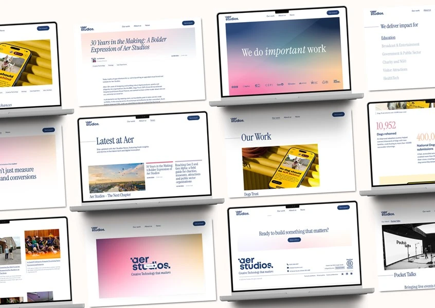
So we got cracking building a new visual brand that brought sophistication and refinement, a more mature Aer Studios - after all, we’re in our thirties now. We replaced cluttered visuals with generous white space, symbolising clarity, openness, and opportunity, anchored by an understated colour palette that feels distinctly hopeful. We created an overall visual energy that captures the optimism so many of our clients embody.
We created a colour system with gradients that feel alive; bold and animated at times, subtle and supportive at others. With individual hues that built a system perfect for waymarking, categorising and highlighting, across all our channels and formats.
We designed a new typographic system combining a classical serif display typeface, Instrument, with a clean, modern body typeface, Lato, for a grown-up editorial feel, but with a modern accessible hierarchy. This allows us to be elegant and striking in our headline messaging, but clear and concise whenever we dive deeper.
This new look is a strategic choice for Aer Studios. By making our identity lighter and less intrusive, our brand sits back and lets our clients’ stories, missions, and impact take centre stage.
Practicing what we preach
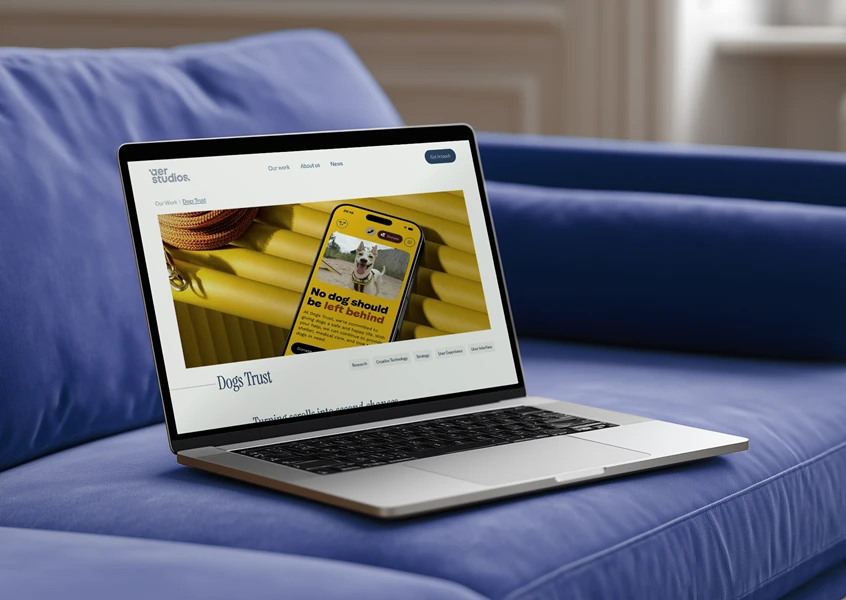
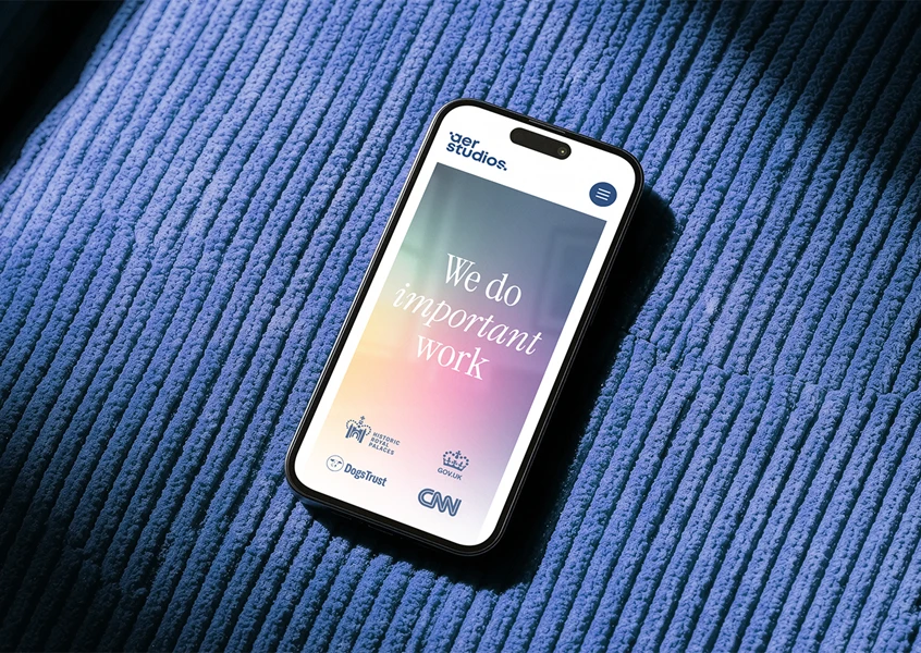
Our new website gives our brand manifesto, updated positioning, and client stories a proper home. It puts the partners we work with front and centre, showing off their missions while giving a clear visual look at what Aer Studio is all about. It’s a living breathing manifestation of what’s important to us.
Together with our new look, it reflects our passion for taking products beyond being genuinely useful, into something beautiful, powerful, and delightful. Delivering on that ambition meant putting Creative Technology into practice from the start. Having constant, 2-way dialogue between strategy, design, and engineering from day one, with no hand-offs or working in silos.
Everyone bangs on about de-siloing, fewer make it happen. We bring engineers into creative strategy early to sharpen it. It gives technical minds room to solve tricky build puzzles long before writing a line of code, helping them spot clever shortcuts and smart ideas during discovery. These inform ideation with technical constraints that drive creativity and innovation.
Treading carefully
Aligning design, tech, sustainability, and accessibility upfront meant we could build something that looks great without compromising site speed or using unnecessary energy. We wanted to push the visual design to create an immersive and engaging experience, while making sensible choices behind the scenes to hit scores we’re really proud of. Finding that sweet spot between visual impact, site speed, sustainability, and total accessibility is where the real work happens.
On the engineering side, hitting that target meant making a few clear trade-offs. We went with a CSS-first approach for our parallax effects instead of shipping heavy JavaScript libraries. We gave up a bit of overly flashy motion, but keeping the code lean earned us A+ performance grades on those pages. Handling rich visual media was another area where we had to be clever. To keep page loads light and carbon impact low without losing image quality, we leaned heavily on WebP formatting to cut file sizes while keeping visuals crisp.
We treated accessibility and sustainability as foundational principles rather than box-ticking exercises. People navigate the web in all sorts of ways, using screen readers, keyboard controls, or magnification, and nobody should get a second-rate experience. Keeping our digital footprint light and our code clean ensures the site works seamlessly for everyone while consuming as little energy as possible. Building with clean, logical layouts doesn't just reduce carbon and make the site accessible; it also makes it dead easy for search engines and AI tools to read and understand what we do, keeping our robot overlords happy to boot.
Senior Full Stack Developer, Gareth Perry, set the tone from the start:
“Where accessibility and aesthetics have come into conflict, our principle has been to favour accessibility. Accessibility comes first because people come first, with stronger discoverability and machine understanding built in as a natural consequence.”
This level of dedication has resulted in a website we are truly proud of, with scores to match.
Lighthouse scores for the homepage alone are:
- Performance - 100
- Accessibility - 100
- Best Practices - 100
- SEO - 100
- Agentic Browsing - 100
The Axe Devtools Accessibility report raised zero critical, moderate, serious or minor issues across Automatic, Guided and Manual categories.
And www.websitecarbon.com gives our homepage A+ with other pages achieving at least an A - This is cleaner than 95 % of all web pages globally.
We’re dead chuffed with these stats, but building a fast, accessible, low-carbon site isn't a one-and-done job. This launch is just our starting line, and we already have a roadmap to keep adding content, improving performance, adding extra accessibility features, and keeping our carbon footprint down, all without losing any of the site's personality.
We’re excited to share it with the world. It’s a chance to celebrate the brilliant team behind the build, highlight the impact we make, and show what really matters to us, and our partners.
Take a look around and let us know what you think.