What “From F to A” Actually took
|8 minutes min read

In the previous article, From F to A: the Choices Behind a More Sustainable Website, we explored the choices behind the new aer studios website. This time, I want to look at what those choices took to implement, where the work became more complicated, and how we measure the result.
The principles were straightforward: use the platform first, build less, and treat every byte as having a cost.
Putting them into practice involved decisions about everything from when we fetch content to what happens to a video when someone leaves the page.
Some were simple. Others took much more work.
Building pages before they reach the browser
Astro gave us a useful starting point.
Our content lives in Umbraco, but the main pages don’t need to fetch that content in the visitor’s browser. Instead, we use Astro to generate them during the build.
The configuration makes that intention explicit:
output: "static"
For CMS-driven routes, getStaticPaths() gets the content entries and maps their URLs to pages Astro will generate. Each page then fetches its content during prerendering and passes it into the relevant components.
The process is relatively straightforward:
-
Fetch the content from Umbraco.
-
Generate the routes and render their components.
-
Produce HTML files ready to serve through the CDN.
By the time someone visits a page, its main content has already been assembled.
That moves work into the build rather than repeating it in the browser on every visit. It also means our CMS integration and content-mapping logic don’t need to become part of a client-side application.
Most of the site’s presentation is built with .astro components. Their templates and build-time logic produce HTML, without requiring each component to become an interactive JavaScript application in the browser.
Where we needed richer interaction, we could introduce it deliberately.
The contact form, for example, uses React with Astro’s client:visible directive:
<ContactForm client:visible />
Astro renders its initial HTML ahead of time, then loads and hydrates the interactive component when it becomes visible.
We still ship JavaScript for forms, video controls, page transitions and other behaviour. The useful distinction is that choosing a framework for one interactive component doesn’t require us to hydrate the rest of the page.
Using the platform instead of adding a dependency
The Testimonials component, found on the About Us page is probably my favourite example of how this thinking shaped the component library.
The requirement was familiar: display one testimonial at a time, provide numbered pagination, and animate between quotes.
A JavaScript carousel library would have given us a starting point. But the interaction we needed was quite specific, and HTML already provides a way to represent one selected item within a group - Radio inputs.
Each testimonial has a corresponding radio button. The pagination controls are labels associated with those inputs. Selecting a label changes the checked radio, and CSS responds to that state.
Here is a simplified version of the structure:
<div class="testimonials">
<fieldset class="controls">
<legend class="visually-hidden">Testimonial slides</legend>
<input
      class="slide-radio"
      type="radio"
      name="testimonial"
      id="testimonial-1"
      aria-label="Show testimonial 1 of 2"
      checked
    />

    <input
      class="slide-radio"
      type="radio"
      name="testimonial"
      id="testimonial-2"
      aria-label="Show testimonial 2 of 2"
    />
  </fieldset>
<ol class="slides">
<li class="slide">First testimonial...</li>
<li class="slide">Second testimonial...</li>
</ol>
<nav aria-label="Testimonial pagination">
<label for="testimonial-1">1</label>
<label for="testimonial-2">2</label>
</nav>
</div>
The inputs are visually hidden while remaining available for keyboard interaction. The slides occupy the same CSS Grid area, and the selected input determines which one is visible.
The essential relationship looks like this:
.slides {
  display: grid;
  overflow: hidden;
}

.slide {
  grid-area: 1 / 1;
  opacity: 0;
  visibility: hidden;
  transform: translateX(100%);
  transition:
    transform 0.8s ease,
    opacity 0.8s ease,
    visibility 0.8s ease;
}

.controls:has(#testimonial-1:checked) ~ .slides > :nth-child(1),
.controls:has(#testimonial-2:checked) ~ .slides > :nth-child(2) {
  opacity: 1;
  visibility: visible;
  transform: translateX(0);
}
:checked identifies the selected radio. :has() allows the containing fieldset to respond to that selection, and the sibling selector connects it to the slides.
The component we built for the Aer site, extends this to position previous slides to the left, move the pagination indicator and show a visible focus outline on the corresponding label. It also removes transitions when someone prefers reduced motion.
There are no event listeners or state-management hooks handling the selection. Native radio state gave us the behaviour we needed without introducing a carousel dependency.
When building less takes more work
Motion was where the platform-first approach became more demanding.
Jay, our Creative Director, had a precise vision for how the homepage should move as someone scrolled. The timing mattered: when text entered, how long it remained readable, when it moved away, and how the video grew into place.
My experiments with FreeFrom had already introduced me to CSS scroll-driven animations. This project gave us an opportunity to apply them to a much more complex design.
In supporting browsers, the implementation uses a named view timeline with animation-timeline and animation-range. CSS describes how each part of the sequence progresses as the visitor moves through the scroll area.
But during the build, we realised that Firefox doesn’t support this so it required a JavaScript fallback for that behaviour. Delivering the intended experience across our supported browsers meant implementing both paths.
We use feature detection to decide whether the fallback needs to run:
CSS.supports("animation-timeline: view()")
The fallback reads timing values from the same CSS custom properties used by the native implementation. It calculates progress through the scroll area and applies the corresponding transforms and opacity.
Scroll and resize updates are scheduled through requestAnimationFrame. Values that remain constant within a breakpoint are cached, and listeners and pending frames are cleaned up when the component is left behind.
We bypass the fallback for users that prefer reduced motion.
Sharing the timing values helped keep the two implementations aligned, but matching the design still took real time. We had to consider different viewport sizes, keyboard focus, video playback and the points where each frame became interactive.
A JavaScript-first implementation using an established animation library would have shipped much faster and honestly, the carbon saving from taking this approach on the two pages it’s used was probably marginal. We haven’t isolated and measured that difference against an equivalent library-based version, so I can’t put a number against it.
That is part of the accounting too.
We couldn’t know in advance which individual decision would contribute most to the overall result. We applied the principles consistently, including where the likely saving was small. The site-wide average reflects the combined implementation; it doesn’t tell us how much credit belongs to any one component.
This experience also gave me a better understanding of the trade-off. Using the platform first can reduce what we ship, while still increasing the time needed to build and maintain a particular interaction.
Loading media only when it earns its place
The media required a different kind of judgement.
Compression, caching and locally served WOFF2 fonts were part of the baseline. The more interesting decisions concerned what should load immediately, what could wait, and what should stop when it was no longer useful.
Our shared image component wraps Astro’s <Image>, defaults images to WebP and preserves SVG images as vectors. The site also configures responsive image handling.
But image format is only part of the decision.
Header images load eagerly because they are part of the experience someone encounters immediately. Many images further down the page use loading="lazy".
Applying lazy loading everywhere would delay important content. Loading everything eagerly would ask the browser to fetch resources before they were needed.
The component’s position and purpose determine the choice.
Video needs attention beyond the initial request.
Our VideoBlock provides a poster and uses:
<video preload="metadata" playsinline poster="...">
<source src="..." type="video/mp4" />
</video>
preload="metadata", which gives the browser a hint to retrieve metadata rather than preload the full video. It isn’t a strict download limit, so we also need to consider what happens during playback and navigation.
The homepage includes logic to pause video when it leaves view. When navigating away from video blocks, we explicitly release their media resources.
The core of that cleanup is:
video.pause();

video.querySelectorAll("source").forEach((source) => {
  source.removeAttribute("src");
});

video.load();
Pausing playback alone doesn’t necessarily stop an ongoing media fetch. Removing the sources and resetting the media element helps prevent the previous page’s video from competing with resources needed by the next page.
That expanded how I thought about “every byte has a cost”. It includes resources that continue loading after someone has moved on.
Making sustainability part of code review
One development I’m really pleased with is that sustainability measurement now sits alongside the code review process.
We already expect automated feedback about our code. Bringing estimated emissions into the same workflow gives us another piece of evidence to consider before a change reaches the website.
Our reporting pipeline builds the Astro site and discovers its generated HTML routes. It serves that build locally with compression enabled, then uses Playwright to visit the pages and collect transferred bytes from completed requests.
Those measurements are passed into CO2.js:
const emissions = new co2({
  model: "swd",
  rating: true,
});

const { total, rating } = emissions.perVisit(bytes, false);
The false argument assumes non-green hosting. Because this is a local build running in CI, we aren’t checking the energy source of a deployed host.
For the overall grade, we calculate the mean estimated emissions across the successfully measured pages, then pass that value into the model’s rating scale.
We average the emissions figures before assigning a grade. Each measured page receives equal weight; this isn’t an average weighted by real visitor traffic.
The “A” rating appears in both our automated reporting and the live homepage’s Website Carbon result, although they measure different things.
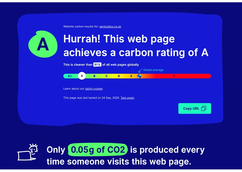
Website Carbon rated the Aer Studios homepage A on 24 September 2026, reporting that it was cleaner than 91% of the pages in its comparison.
Our automated report gives us a broader view of the build. In one recent pull request, it measured 31 pages and estimated average emissions of 0.063g CO₂ per pageview, placing that build’s average in the A band.
The individual results are useful too: five pages received A+, 20 received A, and six received B.
That spread matters. An average of A still leaves room to improve particular pages. The report lists the heaviest first, giving us somewhere concrete to focus our attention.
The two results support the same direction of travel, but they aren’t interchangeable. Website Carbon tests the live homepage, while our CI report gives us a view across the measured pages in a particular build.
The workflow posts these results directly to the pull request alongside Lighthouse performance and SEO checks, keeping them visible during code review.
There are limits to what it tells us.
The measurement covers initial page loads. It doesn’t scroll through every page, play every video or reproduce a complete visitor session. Pages that fail to measure are skipped, so the reported page count matters when comparing results. It also estimates emissions from transferred data rather than directly measuring the energy used by our animations.
The current workflow reports the figures for review. It doesn’t automatically compare them against a baseline or block a merge when the grade worsens. Investigating an increase remains part of the review process.
Even with those limits, the report gives us something valuable: a repeatable way to inspect the consequences of our decisions while we are still making them.
The choices described in the “From F to A: the choices behind a more sustainable website” article become much more useful when we can examine the resulting implementation, acknowledge its costs and keep checking it as the website changes.
Use what the browser already provides. Build what the experience needs. Think carefully about every byte we ask someone to download.
Where this journey started
My journey towards a more sustainable front end began when I was inspired at the Web Developer Conference (WDC) 2025 in Bristol. I would just like to give a shout out to the up and coming WDC 2026 in Bristol on the 9th October. I can’t wait and I hope to see many more engineers there who can get inspired like I did.